![logo_moinai-full-transparent-1.png]](https://helpcenter.moin.ai/hs-fs/hubfs/logo_moinai-full-transparent-1.png?height=40&name=logo_moinai-full-transparent-1.png)
The chat widget provides the interface through which users converse with the AI chatbot. The widget editor defines how it appears on your website, which labels it displays, and which features are available.
This article focuses on the settings that control widget behaviour and text: the appearance of the closed widget, all customisable labels, resetting a conversation, and voice input. For purely visual design choices such as the avatar and colours, see the article Visual customisation overview.
- General information
- Widget display
2.1 Button mode
2.2 Input bar mode - Customising text and labels
3.1 Name, title and placeholder
3.2 Unread message prompt
3.3 Automatic translation
3.4 Live chat system messages - Restart a conversation
- Voice input
- AI indicator for generated answers
- Further articles on the chat widget
1. General information
Access the widget editor in the moinAI Hub via the navigation path Widget & Teasers > Widget Appearance. The editor is divided into two sections: on the left is a live preview of the chat widget, and on the right are the settings, arranged in categories such as Name & Avatar, Customise Elements, Voice Input, or Automatic Translation. Every change appears immediately in the preview.
Two key principles apply throughout this article:
- Settings apply per channel. An AI chatbot deployed across multiple websites or languages can have distinct labels and features for each individual channel.
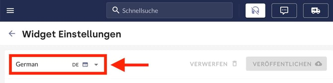 Figure: Channel selection in the moinAI Hub.
 - Changes only take effect in live conversations after selecting Publish. Prior to publishing, modifications remain visible exclusively within the preview.
The widget editor covers all customisations that can be made without writing code. For advanced technical requirements, such as hiding and showing the entire chat widget including its launch icon, use the JavaScript API. The article on controlling and technically customising the chat widget explains this process.
2. Widget display
Before users open the chat widget, it appears in one of two closed states. Select the display mode in the Customise Elements section under the input bar settings using the Button mode and Input bar mode options.
| Display mode | Appearance | Best suited for |
|---|---|---|
| Button mode (standard) | A round chat button with a speech bubble icon along the bottom edge of the website. | Websites where the chat widget should remain discreetly accessible without occupying layout space. |
| Input bar mode (inline input bar) | An input bar docked at the bottom of the website, allowing users to type directly into it. | Content-rich pages and layouts where higher widget visibility is preferred without a floating button. The bar integrates seamlessly into the page structure. |
2.1 Button mode
In button mode, the Alignment setting determines the position of the chat button: Bottom left or Bottom right (the default setting). You can also configure the button colour and its brightness. The built-in contrast checker displays the accessibility rating immediately alongside the colour picker. For detailed instructions on colour settings, see the article on colours in the widget editor.
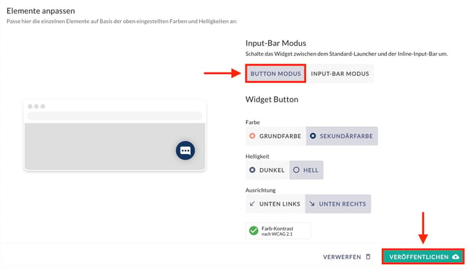
Figure: Button alignment and colour settings in the editor.
Select Publish to save and apply the changes immediately.
To adjust the button position on specific sub-pages or prevent it from overlapping existing web elements (such as a back-to-top button), position it via the JavaScript API as described in the guide on controlling the chat widget via JS API.
2.2 Input bar mode
The input bar appears centered along the bottom edge of the website and, unlike button mode, cannot be aligned to the sides while closed. When opened, users can reposition the open widget flexibly. The closed widget consists of up to three layered elements: the user text input field, the teasers, and the banner.
Interaction with teasers (topics, agents, and form suggestions)
Suggestions and quick-action buttons for AI agents, topics, or forms are not configured directly in the widget editor; instead, they are created as teasers in the Hub via Widget & Teasers > Teasers.
In input bar mode, these suggestions behave dynamically:
- Initial state: When the page loads, only the compact input bar is visible; assigned teaser elements remain hidden in the background.
- Interaction: When a user clicks or taps into the input field (focus), the section expands upwards to reveal the teaser suggestion buttons. Visitors can then select a suggested topic directly or type a question into the field.
For full setup instructions, see the article on configuring teasers.
Banner design
Input bar mode provides dedicated customisation options for the banner in the Customise Elements section:
- Banner text: The welcoming prompt displayed in the closed input bar (e.g. “How can I help you?”).
- Banner gradient start and Banner gradient end: Two colour values that define the gradient background.
- Banner buttons: Select Add button to insert clickable call-to-action buttons. Button label sets the visible button text, Button URL defines the target destination, and Button style sets the visual presentation (Link, Primary, or Secondary).
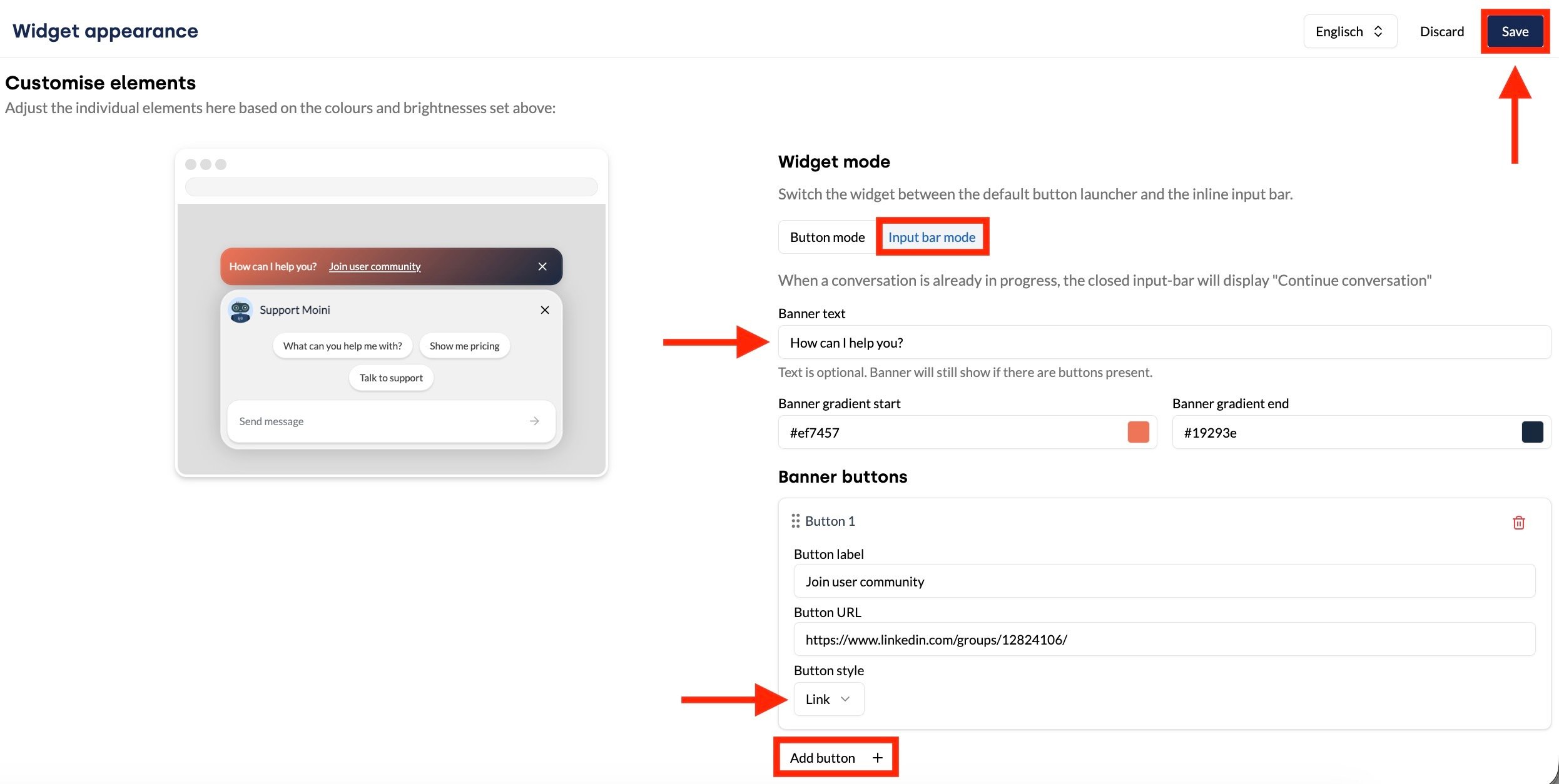
Figure: Banner settings in the Customise Elements area.
If a conversation is already in progress, the closed bar displays the prompt “Continue conversation” instead of the banner text.
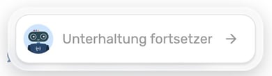
Figure: Closed input bar when a conversation is active.
Select Publish to save and apply your settings.
Position of the opened widget in input bar mode
In input bar mode, the header of the opened chat widget features an alignment tool. This option only appears in input bar mode. It enables users to reposition the chat window dynamically if it obstructs page content.
The menu always offers the two alternative alignments:
- Widget centred: Options for Left and Right appear.
- Widget aligned left: Options for Centre and Right appear.
- Widget aligned right: Options for Left and Centre appear.
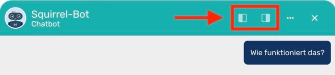
Figure: Centred widget header offering left and right alignment.
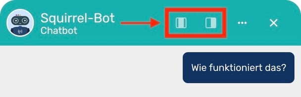
Figure: Left-aligned widget header offering centre and right alignment.
3. Customise text and labels
All labels in the chat widget contain default copy and function without modifications. Customising these labels lets you match your company's tone of voice or introduce terminology familiar to your website visitors.
Keep text in all fields concise. Because the chat widget is narrow on mobile devices, lengthy labels may wrap awkwardly or become truncated.
In addition to visible copy, the interface uses ARIA labels in several places. These strings are invisible on screen and are read aloud solely by screen readers. They convey what an interactive element triggers, so they should state the resulting action rather than merely repeating the button label.
ARIA labels enhance accessibility. For more details on creating an accessible chat experience, see the article on accessibility in moinAI.
3.1 Name, title and placeholder
The Name & Avatar section provides four text fields:
| Field | Location in the chat widget |
|---|---|
| Widget Title | Appears as the main header title in the top bar (e.g. “How can I help you?”). |
| Chatbot Name | Displayed above each message sent by the AI chatbot as the sender name. |
| Chatbot Title | Displayed beneath the widget title in the header as a role subtitle (e.g. “Support Chatbot”). |
| Placeholder Text | Displayed inside the empty text input line (e.g. “Type a message”). |
Beneath these fields, you can configure the avatar and widget colours. Both belong to visual styling and are detailed in the guide to visual presentation of the chat widget.
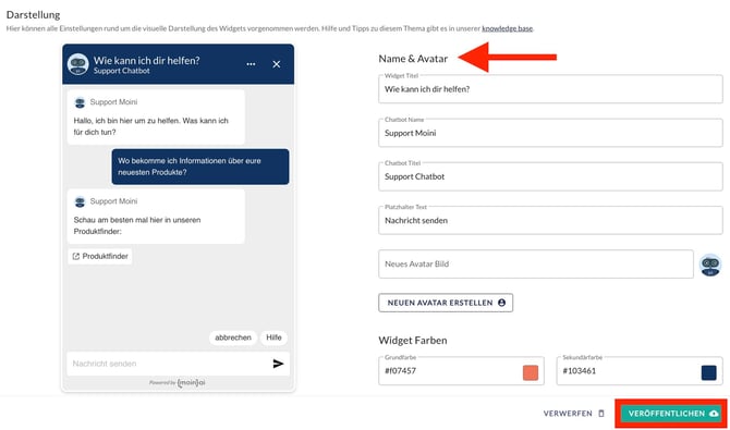
Figure: Text fields in the editor alongside the live preview.
Select Publish to save and apply the changes.
3.2 Unread message prompt
When long answers arrive, the chat window does not automatically jump to the very bottom. Instead, the viewport remains anchored where the question ends and the answer starts, ensuring visitors can read the beginning comfortably. If subsequent elements load (such as a feedback rating query), an unread message indicator appears along the top edge.
Clicking this indicator scrolls directly to the bottom of the conversation. It functions both as a visual prompt and as an interactive button. In the Unread Messages section, you can configure two text elements:
- Visible label: The text displayed on the button (default: “More messages”).
- ARIA label: The text read aloud by screen readers (default: “Scroll down to view further messages”). This setting does not affect visual appearance.
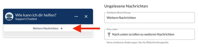
Figure: The unread prompt appears whenever incoming answers exceed the viewport height.
Select Publish to save and apply the changes.
3.3 Automatic translation
The Automatic Translation section appears only for multi-language chatbots. Labels configured here display only when content has been automatically translated in the chat.
Translated messages show a badge and allow users to view the original phrasing with a single click. Both states include a visible label and an ARIA label:
| Field | Default value |
|---|---|
| Automatically translated | Automatically translated |
| Button ARIA label to display original | Display original message translation |
| Original | Original |
| Button ARIA label to display translation | Display automatically translated content |
For information on language support and channel activation, see the article on configuring multi-language chatbots.
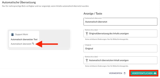
Figure: Translation badge beneath an incoming message.
Select Publish to save and apply the changes.
3.4 Live chat system messages
When a bot handover to a live chat occurs, brief status messages appear in the message history. These cues clarify for users when a human agent responds and when the AI chatbot resumes. In the live chat section, you can customise all three status notifications:
| Field | Default value | Displayed when |
|---|---|---|
| Live chat started | Live chat |
A service team member accepts the conversation. |
| Forward to another agent | Transfer chat |
The conversation is transferred to a colleague. |
| Live chat ended | Chatbot |
The conversation returns to the AI chatbot. |
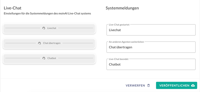
Figure: System message text fields in the live chat section.
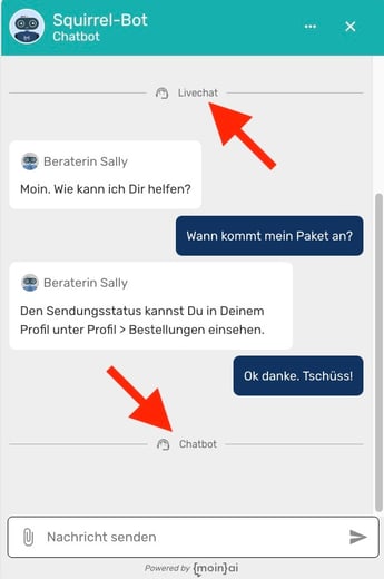
Figure: Conversation history showing system divider lines for handover events.
For a complete overview of handover mechanics, see the article on moinAI live chat functionality.
Select Publish to apply your updates.
4. Restart a conversation
Clicking the 3-dot menu in the chat widget header opens an action menu containing the option Restart conversation. This resets the dialogue and starts a new conversation without requiring a browser reload. It is particularly helpful when a visitor completes an inquiry or wants to restart from the beginning. Selecting this option clears previous messages and displays the initial greeting again.
You can enable or disable the 3-dot menu within the Hub.

Figure: Action menu in the widget header with the restart command.
Select Publish to save and apply the changes.
5. Voice input
Voice input allows users to record spoken audio messages rather than typing. The audio is transcribed automatically and processed just like a typed inquiry. The AI chatbot responds as usual, and both the transcript and audio recording appear in conversation histories and live chat feeds. Transcription is processed by our service partner OVH.
Voice input is disabled by default and must be enabled separately for each channel. Configure the feature in the Customise Elements section under Voice Input:
- Enable the Activate microphone input in widget toggle switch.
- In the Maximum recording duration (seconds) field, define the permitted duration. The default is 10 seconds; up to 60 seconds can be configured.
- Use the Save voice recordings toggle switch to determine whether audio files are retained.
When Save voice recordings is turned off, audio recordings are discarded immediately after transcription. In this case, only the transcribed text appears in the conversation log, with no playable audio file. When the toggle remains active, recordings are deleted automatically after the retention period defined in your data protection settings.
Recordings are never accessible via publicly guessable URLs.
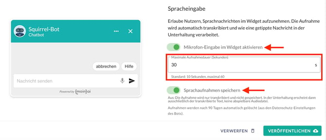
Figure: Voice input configuration options in the Hub.
Voice input is available in the preview and in live production, but not in the AI Playground.
Select Publish to save and apply your configuration.
6. AI indicator for generated answers
Answers generated by the AI chatbot from the knowledge base are labelled accordingly in the chat widget. Beneath generated replies, users see the referenced sources, an indicator noting AI generation, and a disclaimer prompting verification of critical information.
This ensures that users can readily understand how an answer was derived.
For detailed configuration instructions, see the article on the AI indicator in the chat widget.
7. Further articles on the chat widget
The following articles explore additional aspects of the chat widget in depth:
- Chat widget website integration: Embedding via script, Google Tag Manager, iFrame, or within mobile apps.
- Chat widget customisation: Controlling position, opening, closing, and visibility via the JavaScript API.
- Extend website and chat widget interaction: Passing data seamlessly between your website and the conversation.
- Visual customisation overview: Avatars, colours, and contrast guidelines.
- Colours in the widget editor: Primary and secondary colours and customisable palette elements in detail.
- Disable the input bar: Preventing free text input and guiding visitors through predefined answer paths.
- Set up multi-language support: Enabling channel languages and utilising automatic translation.
- AI indicator in the chat widget: Labelling AI-generated answers and meeting legal compliance requirements.