![logo_moinai-full-transparent-1.png]](https://helpcenter.moin.ai/hs-fs/hubfs/logo_moinai-full-transparent-1.png?height=40&name=logo_moinai-full-transparent-1.png)
The colour scheme of the widget allows for seamless integration of the AI chatbot into the brand identity. Defining key colour values creates a consistent user experience that builds trust and supports the visual hierarchy within the chat window.
The widget editor can be accessed via the menu item Widget & Teaser → Widget Appearance.
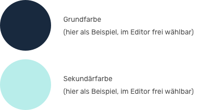
The two colours chosen in this article (shades of blue) are merely examples. The colours can be freely selected in the widget editor.
1. Primary colour and secondary colour
The widget colours are configured in the Display section. Here, two central colour values are first defined, which serve as the basis for the overall appearance of the widget
-
Primary colour: Primary colour tone for prominent elements
- Secondary colour: Complementary colour tone for accents or to distinguish content
The colours can be entered in the corresponding field as a hex code or by clicking on the colour as an RGB colour code.
Changes to these central values have a global effect on all assigned elements. This enables efficient control of the overall colour impression from a central location.

2. Colour assignment for widget elements
Once the primary and secondary colours have been defined, they are individually assigned to the functional components. This allows for flexible design, for example to draw attention to specific interaction points.
Colours can be assigned to the following widget elements in the Customise Elements section: widget button, header and user speech bubble.
The assignment is made in the editor by simply selecting the respective colour for the corresponding element. A live preview on the right-hand side visualises the changes immediately.

3. Contrast options
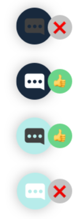
To ensure accessibility and readability, a contrast option (bright or dark) is available for each colourable element. This setting determines the colour of text and symbols (e.g. the X close symbol or the speech bubble in the button) on the selected background.
-
Bright: White text and symbols suitable for dark backgrounds.
-
Dark: Black text and symbols suitable for light backgrounds.
The colour contrast button according to WCAG 2.1 provides information on whether the contrast in the selected element is high enough.
Insufficient contrast makes controls or messages unrecognisable to users. The contrast option should therefore always be chosen based on the brightness of the selected primary or secondary colour.
More information on colour contrast according to WCAG 2.1 and accessible design can be found in this article.


4. Best practices: Dos and don'ts
In the following examples, the primary colour has been deliberately chosen to be particularly dark and the secondary colour particularly light in order to illustrate the different variants for each element.
Widget button
In the following example, the first and last variants have too little contrast. The speech bubble in the widget button is not easily recognisable. Here, it is better to choose the second or third variant.
Widget header
In the following example, the first and last variants have insufficient contrast in the header bar. The text is barely legible, particularly in the first variant. Variant two or three should be selected here.
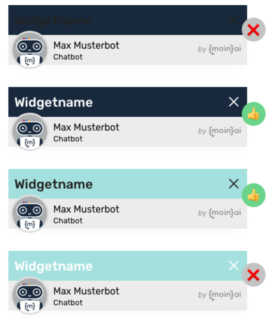
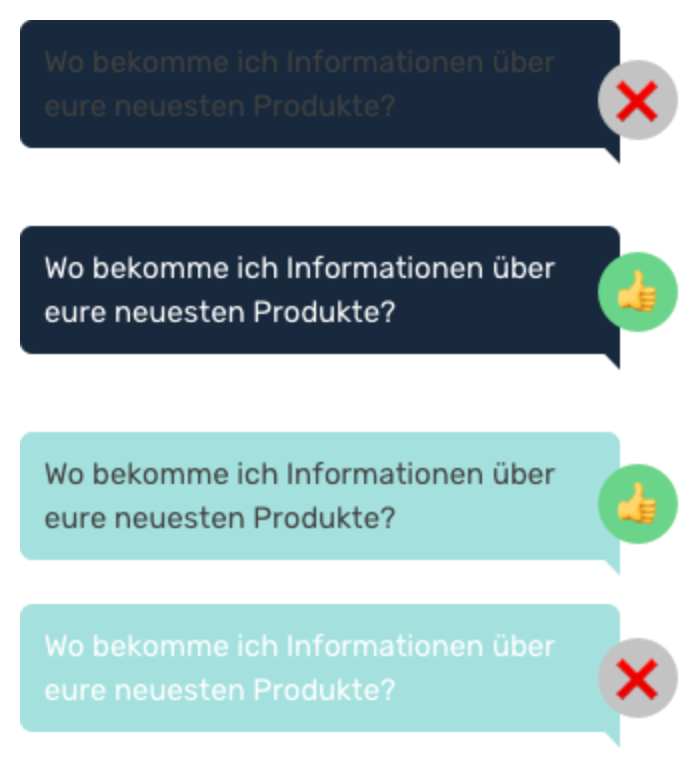
Speech bubble (user)
Similar to the header, the text in the first speech bubble variant is barely legible. In the fourth variant, the contrast is also too weak. Variants two and three are easy to read.
More customisation options for the widget can be found in this article.