![logo_moinai-full-transparent-1.png]](https://helpcenter.moin.ai/hs-fs/hubfs/logo_moinai-full-transparent-1.png?height=40&name=logo_moinai-full-transparent-1.png)
The visual appearance of the widget can be tailored to the corporate design in terms of avatar and colours. A consistent visual design for the AI chatbot strengthens user confidence, reinforces the identity of the digital assistant and ensures a professional brand image on the website.
The widget editor can be accessed via the menu item Widget & Teaser → Widget Appearance.

The two colours chosen in this article (shades of blue) are merely examples. The colours can be freely selected in the widget editor.
1. Avatar
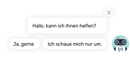
The avatar acts as the ‘face’ of the AI chatbot. It appears as a fictional conversation partner prominently in the header bar of the widget and in the chat history next to each message from the system.
An example of a virtual conversation partner is Moini, the avatar of moinAI.
In the menu item Widget & Teaser → Widget Appearance in the Appearance section, there are two options available:
-
Moini design: An optimised standard avatar that can be colour-customised and optionally feature your own company logo.
-
Own avatar: Upload an individual graphic (e.g. a mascot or a specific symbol). The graphic should be square and optimised for the web. If there are no objections from a corporate design perspective, we recommend using the avatar in the Moini design, as this is already optimised for use with the widget.
Details on how to set this up are described in the article on customising your chatbot avatar.
2. Colours
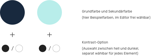
The widget colours are used to visually adapt the widget to the colours of the corporate design, for example. The visual design is created by defining primary and secondary colours. These colour codes form the basis for all interactive and static elements of the user interface. In the widget editor, the live preview shows how the selected colours interact.
If required, you can choose between a light or dark contrast option for each element in accordance with WCAG 2.1.
Brightness (colour contrast options)
For better readability, white is the best contrasting colour for dark blue, whereas black is the best contrasting colour for light blue. The colour contrast according to WCAG 2.1 Button provides information on whether the contrast in the selected element is high enough.


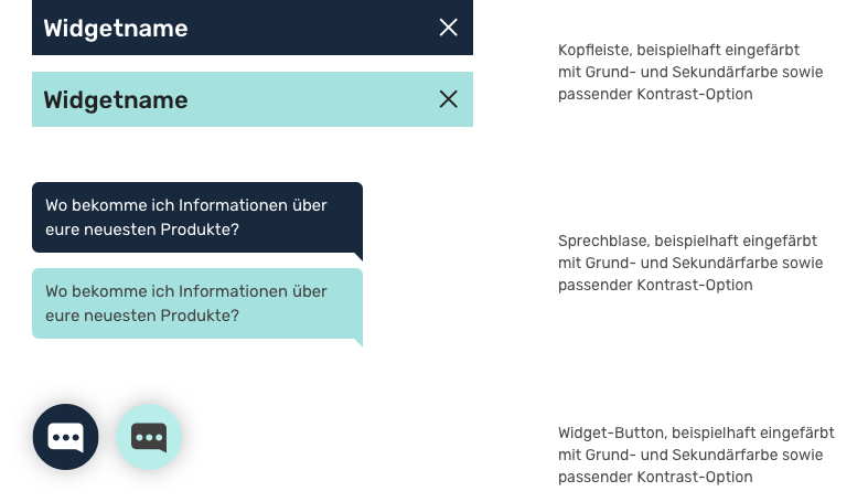
Which elements can be coloured?
The header, message bubble (user) and the widget button when the widget is closed can be coloured. For a differentiated design, the components can be coloured separately. For each element, you can also choose between a light or dark contrast option for the brightness of the font and symbols.
More information about the use of colours is provided in this article on widget colours.