![logo_moinai-full-transparent-1.png]](https://helpcenter.moin.ai/hs-fs/hubfs/logo_moinai-full-transparent-1.png?height=40&name=logo_moinai-full-transparent-1.png)
The topic editor in the moinAI Hub allows you to design and structure responses for the AI chatbot. By using various conversational design elements, you can structure dialogues precisely to optimise the flow of information for users.
Before editing response content in the topic editor, review the following preparation articles:
- Distinguishing between agents and topics – Clarifies when an editorial topic is required
- How is a topic defined? – Assists in defining distinct topic boundaries
- Intent overview & add intent
- Status indicators
- AI response assistant companion
- Structure & management of chatbot responses
- Selection of conversational design elements
5.1 Multiple-choice question
5.2 Yes / No question
5.3 Follow-up - Add content elements
6.1 Text, image, and video
6.2 Slides
6.3 Context and webhook - Closing elements (rating question and happy path)
- Extended context menu of the topic
8.1 Copy to & switch channel
8.2 Change status
8.3 Set up redirection
8.4 Convert topic into an agent
8.5 Rename topic
8.6 Success measurement
8.7 Export & import - Flowchart (tree diagram)
- Reading view
- Additional functions
11.1 Flow preview
11.2 Topic details
11.3 Change log - Save, discard, and publish
1. Intent overview & add intent
Under the menu item Intents, the Intent overview lists all configured intents of the AI chatbot. After selecting a topic, the right-hand info box displays detailed information including title, scenario, status, typical user queries, and relevance.
Create new topics by selecting the Add intent button. Detailed recommendations on creating new topics are available in the article on adding intents.
Clicking the pencil icon opens the topic editor for an existing topic.
2. Status indicators
Upon opening topic content, several status indicators appear in the top-left header. These indicate the current activity status, the publishing status, and the selected channel.
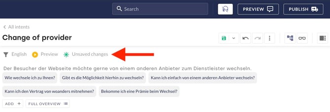
Status indicators
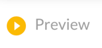
A topic can have only one activity status at any time:
 |
 |
 |
- Deactivated: The topic is deactivated and inaccessible in both the live chatbot and the preview.
- Preview: The topic is active exclusively in the preview. You can test new responses in this mode.
- Live: The topic is live. The response is available in both the live chatbot and the preview.
Publishing status
The publishing status indicates the currency of locally made modifications:
 |
 |
 |
- Unsaved changes: Changes have been drafted locally in the web browser, but not yet permanently saved.
- Not published: Changes have been saved in the editor, but not yet published live to the AI chatbot.
- Published: All changes are saved and available in the live chatbot.
Risk of data loss with unsaved drafts
Unsaved changes remain invisible to other Hub users. If another person edits and saves the same topic concurrently, your open editor retains the previous local draft. Making further adjustments under these conditions creates a risk of overwriting newly saved work from team members.
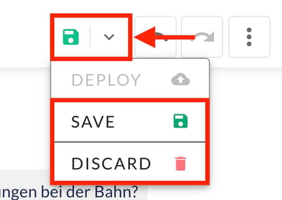
Team synchronisation workflow: To update the topic editor to the latest version saved by team members, click the arrow next to the floppy disk icon and select Discard. This action discards local unsaved drafts and loads the most recently saved version of the topic.
Further information on the publishing status of topic content is described in the section Save, discard, and publish.
Channel view and redirection info
A funnel icon indicates the active channel. When a redirection is active, a blue road sign icon with a right-facing arrow displays the name of the destination (another topic or AI agent).
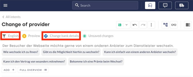
3. AI response assistant companion
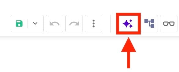
The AI response assistant companion serves as an editorial co-author when crafting responses. Open it via the star icon. companion generates complete response concepts automatically based on an entered website URL, or assists within the editor chat by drafting, rewriting, and expanding individual text and content elements.
Using the companion feature requires activation for your Hub account. Contact the Customer Success Team at customersuccess@moin.ai for enablement.
4. Structure & management of chatbot responses
A chatbot response follows a clear hierarchy managed through conversational design elements. The system distinguishes between conversation flow elements (selected via "Continue with") and visual content elements (selected via the plus symbol).
An optional confirmation question forms the start of a response. The chatbot displays this question only when AI intent recognition detects uncertainty in matching the user request. For optimal flow, compose an introductory sentence that transitions naturally into the main response content, both with and without the confirmation question.
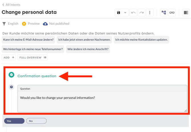
You can configure how frequently confirmation questions appear globally in the Hub. Consult the article about clarifying questions in the chatbot for further details on confirmation questions and conversation management.
The core response follows next, structured using conversational design elements and optional content elements. A defined closing element concludes the response.
Manage & adapt elements
All elements and sections in the topic editor provide uniform options for management and customisation:
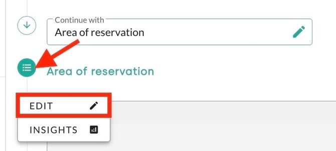
- Edit section label: Each element has its own section label (for example, "Multiple Choice Question [2]"). Click the circle next to the label and select Edit to customise the name.
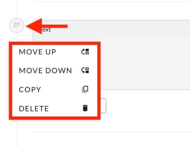
- Copy & move: Use the three-dot menu on the left side of any conversational design element to copy text, images, or slides, or move them upwards and downwards. This mechanism also allows convenient reordering of response buttons within multiple-choice or Yes/No questions.
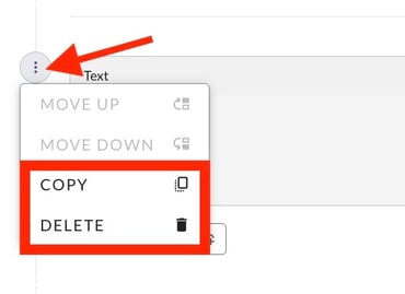
- Paste copied elements: Select the plus symbol in the destination section and click Paste to position previously copied elements in a new location. When no element is currently copied, this option is greyed out.
- Select the desired element via the three-dot menu and click Copy.
- Click the plus symbol in the target section to open the element selection bar.

- Click Paste to insert the element at the designated position.

To navigate to an existing section instead of duplicating it, use the reference function (see article on copying and setting references). - Select the desired element via the three-dot menu and click Copy.
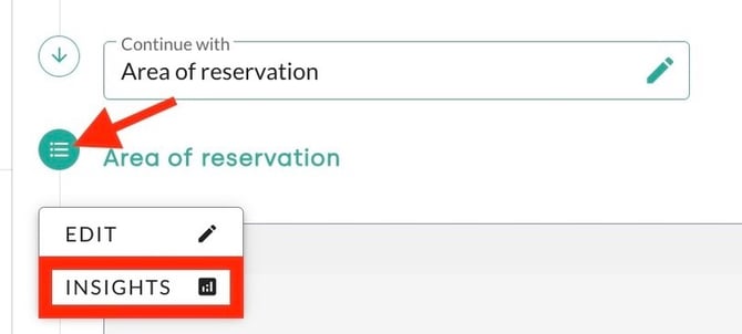
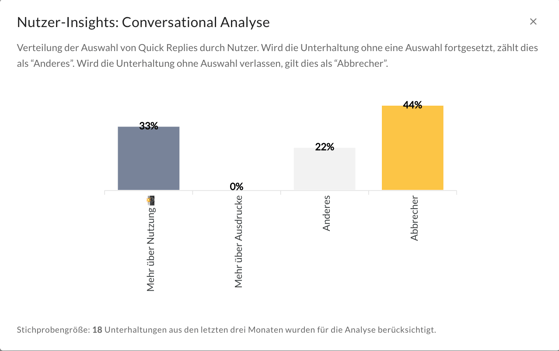
- Insights (analytics data): On branching elements (such as multiple-choice or Yes/No questions), clicking the circle next to the element reveals response distributions and analytical data (insights) for that specific element.
5. Selection of conversational design elements
Use the Continue with button within or at the end of topic content to control dialogue progression. Branching conversational design elements operate identically to elements in the form editor. Available elements comprise Multiple Choice Question, Yes / No Question, and Follow-up.

5.1 Multiple-choice question
The multiple-choice question presents users with text and multiple quick-reply buttons as response options. These buttons disappear upon selection and direct users to specific sub-responses.
- Example: In hotel bookings, the multiple-choice question "Which area would you like to make a booking for?" with the buttons "Rooms & Suites", "Wellness & Spa", and "Table Reservation" guides guests directly into the relevant booking pathway.
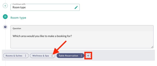
Add further buttons via the plus symbol, or use the three-dot menu on quick-reply buttons to reorder, rename, duplicate, or delete buttons.
5.2 Yes / No question
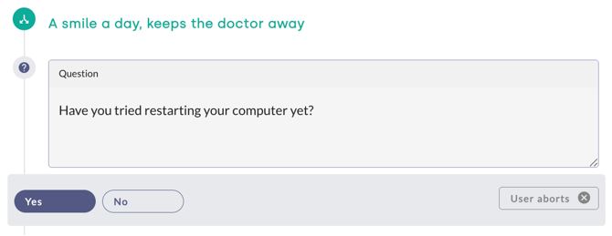
The Yes / No question functions similarly to the multiple-choice question. Alongside the editable text field, it features two fixed options: "Yes" and "No". Their order and labels cannot be modified.
When users respond using free text, such as "Yes, please", the chatbot interprets and processes the answer automatically.
Moving and copying elements, as well as viewing analytical insights, follow standard procedures across all elements, detailed in the section on structuring and managing chatbot responses.
5.3 Follow-up
A follow-up enables seamless transition to another topic or form (for instance, transferring to a designated contact person via a Human Takeover form).
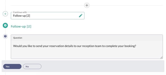
- Example: At the end of a booking flow, a follow-up asks: "Would you like to send your reservation details to our reception team to complete your booking?" Selecting "Yes" initiates the Human Takeover transfer form.
6. Add content elements
Click the plus symbol within a response step to insert additional content elements and format information visually. These elements function identically to the content elements in the form editor. Available options include Text, Image, Video, Slides, Context, and Webhook.


6.1 Text, image, and video
Text
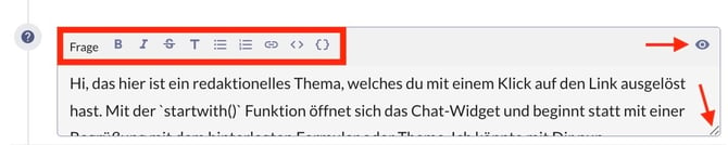
The Text element inserts a standard text box where you can add and format text. Drag the bottom-right corner to expand the box when content exceeds the default size.
The eye icon at the top of the element toggles between edit mode and locked mode for that specific block. This lock prevents unintentional edits. The pencil icon that appears in locked mode returns the element to edit mode.
Each text box supports up to three URL buttons. Buttons below text messages link to external web pages, email addresses, and telephone numbers. Unlike questions containing Yes/No buttons or multiple-choice selections, URL buttons provide navigation links without capturing dialogue replies.
- Example: After recording a booking enquiry, the AI chatbot sends the message: "Your reservation request has been received. For immediate modifications, contact our hotel reception directly by phone or email." Two buttons appear below: "Call Reception" (linking
tel:00442079460123) and "Send Email" (linkingmailto:reception@example-hotel.co.uk?subject=BookingModification).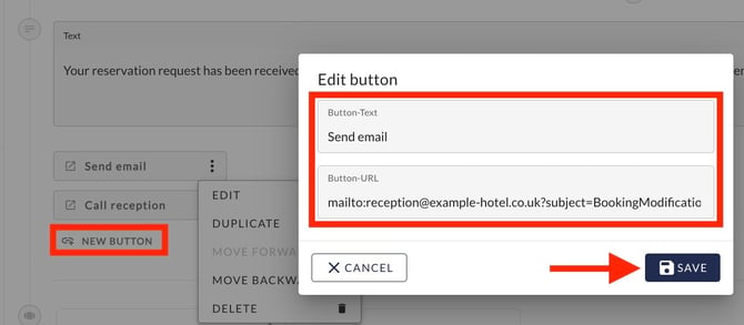
Image
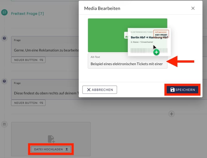
The Image element provides visual support for instructions and explanations. Add an image by uploading a file or dragging and dropping it directly into the field. To maintain accessibility compliance, enter a clear, objective Alt-text in the designated field for every image. Click Save to attach the element to the form section.

Optimal image format
Use web-optimised images to ensure fast loading times. Upload images in landscape orientation (width greater than height) with small file sizes (under 150 KB, such as .png or .jpg file type). An aspect ratio of 1:2.35 (for example, 500 × 1,175 px) ensures optimal rendering inside the widget.
Video
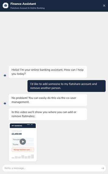
The Video element functions similarly to image embedding. Videos explain complex procedures dynamically through screen recordings or guided workflows.
- Example: In financial services, a short tutorial video within a form shows users how to locate necessary documents for an application.
Optimal video format
You can upload videos in .mpg or .mov format. Keep file sizes as small as possible to guarantee fast widget loading. The maximum permitted file size per video is 100 MB.
6.2 Slides
The Slides element creates an interactive image carousel. Each slide can hold an image, title, description, and URL button. As with the text element, buttons support external web links, phone numbers, and email addresses. Refer to the article on linking email addresses and telephone numbers for detailed instructions.
- Example: A hospitality provider presents room categories through slides, providing descriptions and direct booking links to assist users in making decisions.
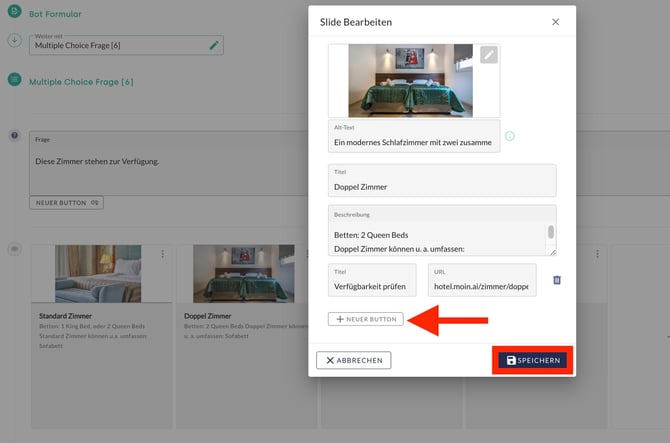
To retrieve dynamic content from third-party systems in real time and render it as slides, integrate a webhook. Detailed instructions are available in the article on webhooks.
6.3 Context and webhook
Context
The Context element acts as the AI chatbot's memory notepad. It stores specific details during the dialogue to control chatbot behaviour in subsequent steps. Similar to a hotel receptionist who notes a guest's vegan diet to recommend suitable restaurants unprompted later, the system remembers key user data throughout the conversation.
Webhook
Selecting Webhook connects your response flow with external systems to send data or retrieve real-time information (such as order status updates). Consult the webhook article for complete configuration steps.

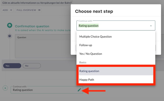
7. Closing elements (rating question and happy path)
Two closing options are available to conclude a topic:
- Rating question: Asks users about their satisfaction with the answer (for example, "Did this answer resolve your enquiry satisfactorily?"). Upon receiving positive feedback, the chatbot delivers a brief acknowledgment (for example, "Thank you for your rating!"). Submitting a rating automatically routes into the Happy Path (for positive feedback) or Unhappy Path (for negative feedback). Rating evaluations appear in statistics and inform success measurement. Find out more about rating questions and best practices in this article.
- Happy Path: Concludes a topic without recording ratings or conversions. The chatbot informs users that they can ask further questions and can display a navigation carousel containing three to six slides with action buttons (linking to URLs or further topics). For full details on the Happy Path, refer to this article.
8. Extended context menu of the topic
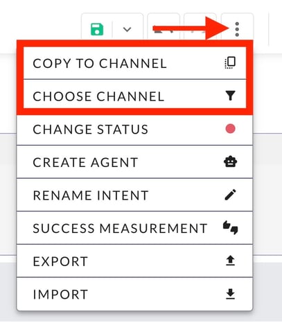
The three-dot menu located in the top toolbar next to the topic title allows comprehensive actions across the entire topic.
8.1 Copy to & switch channel
Switch between channels or duplicate topic content across channels directly inside the editor.
- Copy to channel: Copies the entire topic content into another channel of the AI chatbot for time-saving reuse. Selecting the target channel creates the copy. The Hub translates content automatically into the target channel language.
Subsequent modifications made in the primary channel do not sync to other channels automatically. To update secondary channels, save changes, click Copy to channel again, and choose the target channel to overwrite the earlier version with the updated translation.
- Choose channel: Switches the active channel view to inspect content and apply individual channel-specific adjustments.
For more information on channel setup and management, consult this article.
8.2 Change status
Switch topic status between Live, Preview, and Deactivated.
| Colour | Status | Meaning |
|---|---|---|
| 🔴 | Deactivated | The topic is deactivated in both the Hub Preview and the live chatbot. |
| 🟡 | Preview | The topic is active exclusively in the Hub Preview for testing. |
| 🟢 | Live | The topic is active in both the Hub Preview and the live chatbot. |
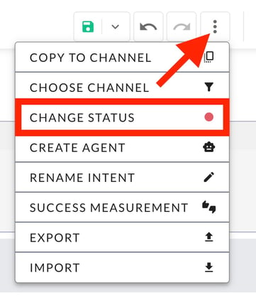
The current status remains visible at all times as a status indicator.
8.3 Set up redirection
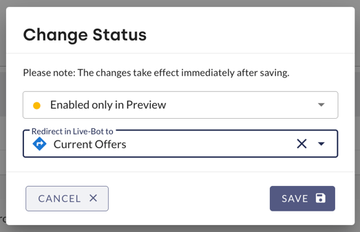
When a topic is in Deactivated or Preview status, you can set up a redirection to another topic or AI agent.
- Example: Deactivating a seasonal topic such as "Christmas Special" allows you to redirect user enquiries to the topic "Current Offers" or a dedicated wellness AI agent. This redirection prevents enquiries from remaining unanswered.
8.4 Convert topic into an agent
The Create agent button converts the editorial topic into an independent AI agent. For guidance on when to choose an agent over an editorial topic, consult this article.
Converting content types results in data loss. If you saved the draft prior to conversion, you can restore previous data from the change log during a future reverse conversion. Regular saving is strongly recommended.
8.5 Rename topic
Renames the topic within the Hub. You can also perform this change in Topic details and the Intent overview.
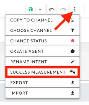
8.6 Success measurement
Performance measurement defines whether response success is measured through the rating question (Yes / No) or via a conversion goal. Detailed guidance is available in the article on user conversion and performance measurement.
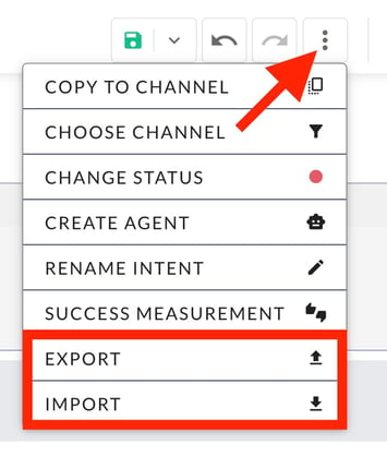
8.7 Export & import
Export downloads the topic structure as a JSON file to your local computer. Import uploads JSON-formatted topic configurations into the Hub.
9. Flowchart (tree diagram)
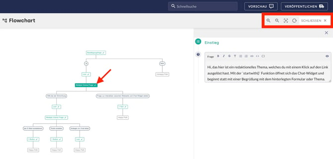
Open the flowchart (also referred to as a tree diagram) by selecting the three-tiered chart icon. It illustrates the complete dialogue architecture visually.

Use the pencil icon beside individual elements to adjust section names and content in a split-screen view. The left panel shows the streamlined structural tree without text content, while the right panel displays the editor for the selected element. Clear section labels simplify navigation significantly. Control tools in the upper right corner allow you to:
- Magnifying glass with plus: Zoom in.
- Magnifying glass with minus: Zoom out.
- Rectangle with circle: Reset view.
- Circle with arrow: Reload flowchart.
- Close: Exit the flowchart and return to the standard editor.
10. Reading view
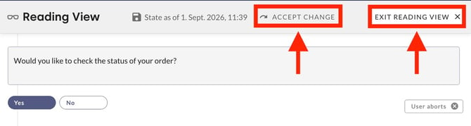
The reading view displays the current state of the response flow in a clean, non-editable layout. Open reading view by clicking the glasses icon; exit by clicking Exit reading view.

11. Additional functions
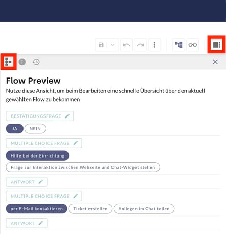
Manage high-level navigation and revision history via additional functions in the toolbar. Click the additional functions icon on the right edge to open the sidebar.

11.1 Flow preview
Flow preview (the structural icon with three horizontal lines and branches) provides a rapid visual map of response sections for orientation. Adjust section names via the pencil icon. Clicking any section title navigates directly to that position in the editor.
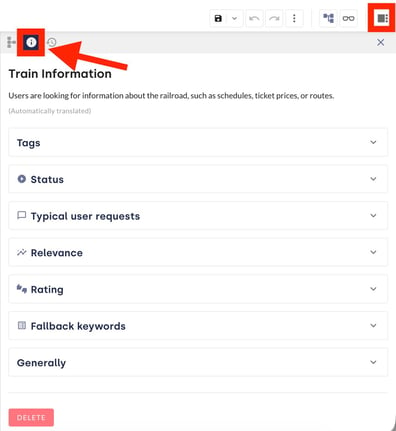
11.2 Topic details
The information icon (i) opens general metadata for the topic. This view matches the Intent overview. Edit the topic name and description here.
11.3 Change log
The change log opens via the clock icon in the sidebar and records all saved revisions. Select Full overview to review modifications made by each account.
Click the glasses icon beside an entry to inspect that revision in reading view.
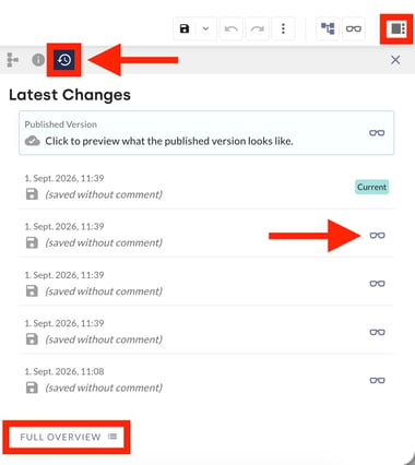
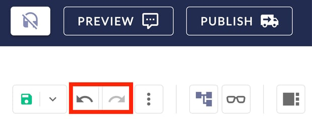
- Use the arrow keys (Undo / Redo) to navigate between versions.
- Click Exit reading view to leave without altering the current editor state.
- Click Apply to overwrite the current working draft with the selected historical version. Clicking Full overview lists team members who made changes alongside exact timestamps.
12. Save, discard, and publish
When you make changes to response content, you can either save or discard them. Click the save icon (floppy disk icon) to save. Clicking the adjacent arrow opens options to save or discard drafts.
Selecting the save icon (floppy disk icon) displays a modal to record notes on your adjustments. Adding a concise change note is recommended to keep revision history transparent and traceable in the change log for all Hub users.
Undo and redo changes
Use the toolbar arrows to undo (left arrow) or redo (right arrow) recent editing steps. Once you save the current draft, undo and redo history for earlier steps clears. In that situation, restore previous states through the change log.
Publish
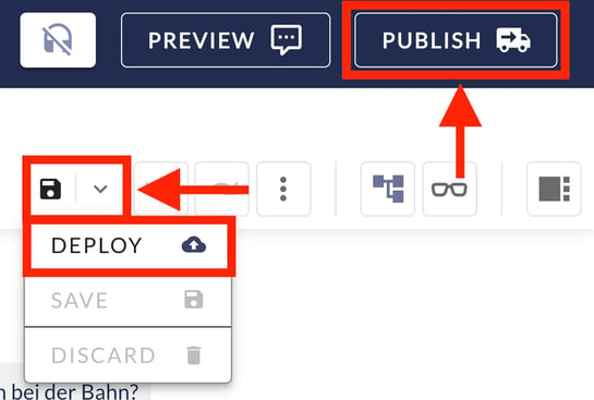
After saving, enable your updates by clicking Publish. Your changes become active in the live AI chatbot only once published.
With the central publishing function, you can publish saved topic modifications individually without simultaneously releasing all other pending chatbot updates. Consult the article on the central publishing function for further details.
Whenever unpublished or unsaved changes to topics exist, a blue notification bar at the top of the moinAI Hub highlights the pending publishing status.
Recommended procedure before publishing
Follow these quality assurance steps before activating modified response content in the live AI chatbot:
- Adjust and save content: Make your edits in the topic editor, click the save icon (floppy disk icon), and record a concise change note.
- Activate preview: Select the Preview button in the control bar to enter preview mode.
- Test response behaviour in the preview AI chatbot: Thoroughly inspect conversational design elements and dialogue flow in the preview.
- Publish: After successful validation, click the Publish button to deploy the new content live.