![logo_moinai-full-transparent-1.png]](https://helpcenter.moin.ai/hs-fs/hubfs/logo_moinai-full-transparent-1.png?height=40&name=logo_moinai-full-transparent-1.png)
Answer templates integrate visual elements such as sliders or URL buttons into the answers of an AI agent. The structured presentation improves the user experience and directs attention to specific products or services. As a result, the templates can increase the interaction rate and guide users through the widget more effectively. Sliders can also be filled directly with data from an AI action, for example with products from a shop system.
Contents
1. How it works
2. Create an answer template
2.1 Image display and image source
2.2 Card configuration
3. Fill sliders with data from AI actions
3.1 Action Data or AI Generated
3.2 Process in the chat and requirements
3.3 Set up a template with Action Data
3.4 Example: washing machine shop
4. Use cases
4.1 Product search
4.2 Event information
1. How it works
Two types of templates can be created under Knowledge Base: sliders (cards) and buttons. The templates are available to the AI agent and are used in answers when the AI agent considers them suitable or when the conditions defined in the Instruction (RAG) are met.
For sliders, the Card source defines who fills the cards:
- AI Generated: The AI agent writes the title, description and buttons for each card based on the instructions. Instead of entering static responses, the individual fields are ‘prompted’: the AI agent receives instructions on what type of information (e.g. an event title or a price) should appear in which position.
- Action Data: The cards come directly from the response of an AI action, one card per item. For details, see chapter 3.
2. Create an answer template
Answer templates are created in the Hub under Knowledge Base > Answer Templates.
- In the Knowledge Base menu, click the arrow to the right of Answer Templates to open the section.
- The Select template … drop-down offers four template types: Product slider, Event slider, Empty template for sliders and Empty template for buttons.
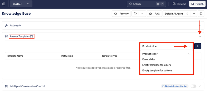
- Click the plus icon next to the selected template. The New Template window opens.
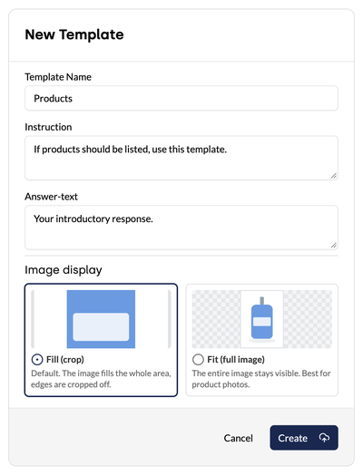
- The window contains three fields:
- Template Name: a unique name for the template.
- Instruction: defines the context in which the AI agent uses the template (e.g. ‘If products should be listed, use this template.’).
- Answer-text: the introductory sentence that appears before the visual elements.
For Product slider and Event slider, the template name and instruction are already filled in. Only the answer text needs to be adapted.
2.1 Image display and image source
Image display defines how images appear on the cards:
- Fill (crop): Default. The image fills the whole card, and the edges are cropped.
- Fit (full image): The whole image remains visible. Ideal for product photos.
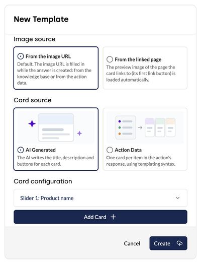
Image source defines where the image comes from:
- From the image URL: Default. The image URL is filled when the answer is created, from the Knowledge Base or from the data of an AI action.
- From the linked page: The card automatically shows the preview image of the page that its first button with a link points to. Messaging apps show the same preview image when a link is shared.
With From the linked page, there is no need to search for or upload images individually. The image shows directly where the link leads and stays up to date automatically. Incorrect or made-up image URLs on product and landing page cards are no longer possible.
Note: If the linked page has no preview image, the card appears without an image.
2.2 Card configuration
The Card configuration defines how the AI agent fills the cards. The configuration applies to the card source AI Generated, which is set by default. Chapter 3 covers the card source Action Data.
Click the arrow to the right of the card name to expand the card for detailed configuration.
Image URL, Title and Subtitle can contain specific links or names, or instructions. The AI agent follows the instructions and adapts the content dynamically to the results. The example image below contains instructions.
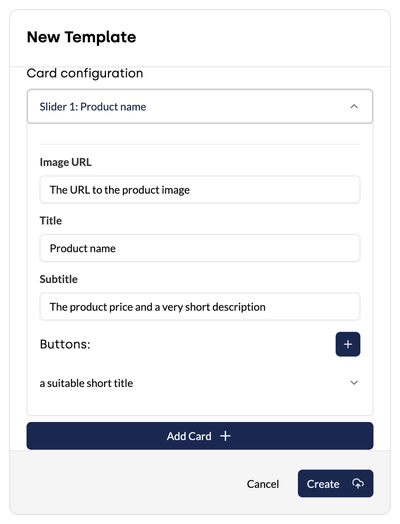
Click Add Card to assign multiple cards to the template.
Under Buttons, click the plus icon to add buttons to the card. Buttons take users to products or services and increase the click rate. Title and Button URL can contain specific values (e.g. ‘Choose size’, ‘Find out more’, ‘Open article’) or instructions (e.g. ‘The product URL’). The AI agent places the URLs dynamically in the right place.
For the Empty template for buttons, the buttons are created in the same way directly under Buttons, without cards.
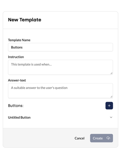
Click Create to save the answer template.
3. Fill sliders with data from AI actions
With the card source Action Data, sliders are created directly from the response of an AI action with a webhook, for example a product selection from a shop system. Each item in the response becomes a card. The information on the cards is defined once in the template.
3.1 Action Data or AI Generated
With the card source AI Generated, the AI agent reads the response of the AI action and writes each card itself: title, description, image and buttons. The approach works, but takes longer with many items. In addition, the AI agent may rephrase, shorten or mix up values even though the data is already complete.
With Action Data, the system transfers the values directly to the right place on the card. The AI agent only calls the AI action and selects the matching template. Action Data offers three advantages:
- Reliable: The cards show exactly the values from the response.
- Consistent: Every card has the same structure, regardless of the number of items.
- Usually faster: The AI agent does not have to write the cards itself.
| Action Data | AI Generated | |
|---|---|---|
| Suitable when … | the data is cleanly structured and should appear unchanged | the data is unstructured or the AI agent should summarise, select or rephrase content |
| Who creates the cards? | the system, based on the template | the AI agent |
| How many cards? | one per item in the response, limited by Max. cards | as many as the AI agent selects |
3.2 Process in the chat and requirements
An answer with Action Data works like this:
- A user asks in the chat, for example: ‘Which washing machines do you have under €700?’
- The AI agent calls the matching AI action. The action returns the records, and the AI agent uses the instruction to select the matching answer template.
- The system finds the list in the response and creates one card per item based on the card configuration.
- The chat shows the answer text with the slider below it.
Note: If the AI action returns an empty list, neither the slider nor the answer text appears. The AI agent then replies on its own, for example that no washing machines are currently in stock.
Requirements:
- An AI action with a webhook is set up and returns a list of records, for example products.
- The structure of the webhook response is known, meaning which fields exist and their exact names. If in doubt, the person who implemented the webhook can help.
Note: Only AI actions with a webhook are available under Webhook Action. AI actions with a CSV file cannot be selected for Action Data.
3.3 Set up a template with Action Data
Step 1: Basic details
Enter the template name, instruction and answer text as described in chapter 2.
Step 2: Image source and card source
- Under Image source, define where the image comes from (see chapter 2.1). From the linked page is useful if the AI action does not return image URLs. For buttons from a list, the first list entry counts as the first button with a link.
- Under Card source, select the option Action Data.
- In the Webhook Action field, select the AI action whose response provides the cards.
- Optionally, limit the number of cards in the Max. cards field. If the field is empty, there is no limit. A limit makes sense if the AI action can return a large number of results.
Step 3: Path to items
In the Path to items field, enter where the list that the cards are created from sits in the webhook response:
| Response structure | Entry |
|---|---|
The response itself is a list and starts with [ |
Leave the field empty |
The list sits under a name, e.g. { "products": [ … ] } |
products |
The list sits deeper, e.g. under result and within it under products |
result.products |
All other information in the response, such as a status or the number of results, is ignored.
Important: If the system finds no list under the path to items, the template is not used. The chat then shows neither a slider nor an error message. In this case, test the AI action in the AI Playground and check whether the path matches the structure of the webhook response.
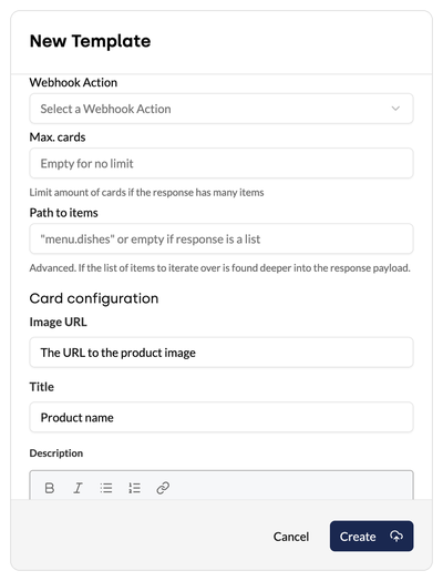
Step 4: Design the cards
With Action Data, the Card configuration contains only one card. The card serves as a template and is repeated for every item in the response. When the card is displayed, the system replaces placeholders in double curly brackets, for example {{ model }}, with the value from the webhook response.
In the Card configuration, fill the fields with placeholders:
- Image URL: only relevant for the image source From the image URL, for example
{{ image }}. - Title: for example
{{ brand }} {{ model }}. - Description: free text with placeholders. The toolbar formats the text: bold, italic, bullet lists, numbered lists and links.
Three rules apply to placeholders:
- The reference point is the individual item in the list: so
{{ model }}, not the full path through the entire response. - Nested values are reached with a dot:
{{ price.amount }}. - Free text and placeholders can be combined freely:
Now €{{ price.amount }} instead of €{{ price.rrp }}.
The values appear on the card unchanged, exactly as the webhook response delivers them. The AI action should therefore deliver prices in the desired format, for example ‘549.00’.
Important: Placeholders must match the field names in the webhook response exactly, including upper and lower case. If the field is called Model, the placeholder is {{ Model }}, not {{ model }}.
Step 5: Define the buttons
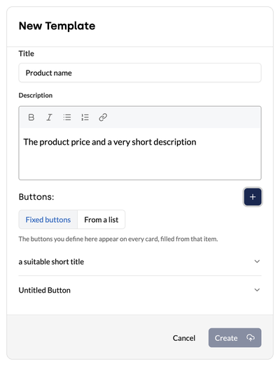
Under Buttons, select one of the two options:
- Fixed buttons: The buttons defined here appear on every card and are filled with the values of each item, for example always ‘View product’. Add more buttons via the plus icon.
- From a list: If each item has its own list of links, the system creates one button per entry. The number can differ from card to card. In the Path to buttons field, enter where the list sits within the item, for example
links. In Title and Button URL, the placeholders refer to the respective list entry, for example{{ label }}and{{ url }}.
3.4 Example: washing machine shop
A shop returns a list of washing machines on request. The webhook response looks like this:
[
  {
    "item_number": "WM-8014",
    "brand": "Northline",
    "model": "AquaPro 8",
    "capacity_kg": 8,
    "spin_speed": 1400,
    "energy_class": "A",
    "price": "549.00",
    "image": "https://shop.example.com/img/wm-8014.jpg",
    "url": "https://shop.example.com/p/wm-8014"
  },
  {
    "item_number": "WM-9216",
    "brand": "Whitehall",
    "model": "SilentCare 9",
    "capacity_kg": 9,
    "spin_speed": 1600,
    "energy_class": "A",
    "price": "679.00",
    "image": "https://shop.example.com/img/wm-9216.jpg",
    "url": "https://shop.example.com/p/wm-9216"
  }
]
The matching configuration:
| Field | Value |
|---|---|
| Path to items | empty, because the response itself is a list |
| Image URL | {{ image }} |
| Title | {{ brand }} {{ model }} |
| Description | {{ capacity_kg }} kg, {{ spin_speed }} rpm, energy class {{ energy_class }}. Price: €{{ price }} |
| Buttons | Fixed buttons |
| Button 1 | Title: View product, Button URL: {{ url }} |
| Button 2 | Title: Check availability, Button URL: https://shop.example.com/stores?item={{ item_number }} |
Result: The chat shows two cards, for example ‘Northline AquaPro 8’ with the description ‘8 kg, 1400 rpm, energy class A. Price: €549.00’ and the buttons ‘View product’ and ‘Check availability’.
Variant: buttons from a list
If each product has its own links, for example:
"links": [
  { "label": "View product", "url": "https://shop.example.com/p/wm-8014" },
  { "label": "Data sheet (PDF)", "url": "https://shop.example.com/datasheet/wm-8014.pdf" }
]
Then select From a list for the buttons:
| Field | Value |
|---|---|
| Path to buttons | links |
| Title | {{ label }} |
| Button URL | {{ url }} |
If one product has two links and another has three, the first card gets two buttons and the second gets three.
4. Use cases
The following examples use the card source AI Generated.
4.1 Product search
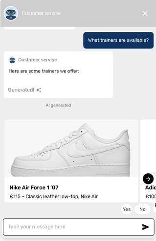
The following example shows how a product range is presented for sales in a slider with images and text. In response to the question ‘What trainers are available?’, the AI agent displays a slider showing all available trainers, including a card featuring white Nike Air Force trainers with an image, price and a ‘Buy now’ button.
| Field | Entry |
|---|---|
| Template Name | Products |
| Instruction | If products should be listed, use this template. |
| Answer-text | Provide information about which products have been found. |
| Image URL | The URL to the product image |
| Title | Product name |
| Subtitle | The product price and a very short description |
| Button title | a suitable short title (e.g. ‘Buy now’) |
| Button URL | The product URL |
4.2 Event information
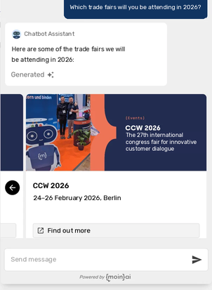
When users ask about trade fairs or events, the AI agent generates a slider with upcoming dates. For example, in response to the question ‘Which trade fairs will you be attending in 2026?’, the AI agent displays a slider showing all events, including a card for CCW 2026 with an image, date and a ‘Find out more’ button.
| Field | Entry |
|---|---|
| Template Name | Events |
| Instruction | If events should be listed, use this template. |
| Answer-text | Name the trade fairs where the company is exhibiting. |
| Image URL | A URL to the event image |
| Title | Event name |
| Subtitle | The event date and a very short description |
| Button title | a suitable short title (e.g. ‘Find out more’) |
| Button URL | The event URL |